Welcome to Reproducible Research Network
Nick George
nicholas.m.george@ucdenver.edu
A network of students and faculty encouraging reproducible research and data analysis practices
https://ucd-reproducible-research-clinic.github.io/
https://nickgeorge.net Presentation
https://ucd-reproducible-research-clinic.github.io/can-graphpad-do-this/p-value-plots.html
Can Graphpad do this?
Plots and code taken from:
GraphPad
- easy(ish) to use
- decent plots
- walks you through basic stats
- ???
plot
- we have time series or dose-response data and we want to plot it
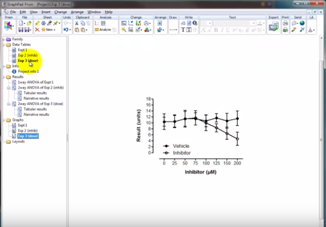
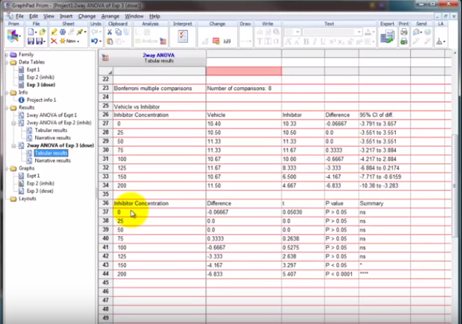
statistics
- which ones are significant?
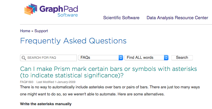
"Write the asterisks manually"
problem
$150-300/year license to copy paste asterisks?
How is this not figured out by now?
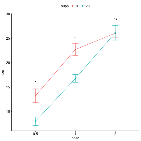
What about this?
- What if you could generate a chart that looks like this with a few lines of code?
ggpubr
- R programming language
Add on libraries:
- ggplot2
- ggpubr
Free as in beer, Free as in speech
How?
library(ggplot2)
library(ggpubr)
 str(ToothGrowth)
'data.frame':	60 obs. of  3 variables:
 $ len : num  4.2 11.5 7.3 5.8 6.4 10 11.2 11.2 5.2 7 ...
 $ supp: Factor w/ 2 levels "OJ","VC": 2 2 2 2 2 2 2 2 2 2 ...
 $ dose: num  0.5 0.5 0.5 0.5 0.5 0.5 0.5 0.5 0.5 0.5 ...
- This dataframe (spreadsheet) has two treatments (Orange Juice, Vitamin C)
- contains a dose and measured length of teeth
Plot
This is as easy as:
library(ggplot2)
library(ggpubr)

data("ToothGrowth")

ggline(ToothGrowth, x = "dose", y = "len", add = "mean_se",
          color = "supp")+
  stat_compare_means(aes(group = supp), label = "p.signif",
                     label.y = c(16, 25, 29))
For the multiple comparisons,
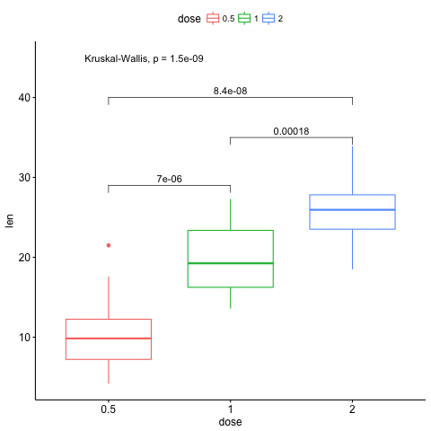
# specify comparisons
 my_comps <- list(c("0.5", "1"), c("1", "2"), c("0.5", "2"))

 ggboxplot(ToothGrowth, x = "dose", y = "len",
           color = "dose")+
   stat_compare_means(comparisons = my_comps,
                      label.y = c(29, 35, 40))+
   stat_compare_means(label.y = 45)
How can I do this with my data?
come to RRN meetings!
How is this reproducible?
You go from your RAW data to this plot
- all steps are recorded
- all steps are automated
- no copy paste mistakes!
- prettier plots!
Links
Plots and code taken from:
Spread the word and let us help you!